Color Contrast Tips for Designers and Developers
This article applies to: Web Accessibility
When it comes to accessibility on the web, color contrast is an area that can affect multiple audiences, with or without disabilities. Websites with good color contrast can help users with color blindness, low vision or even those reading later at night when their eyes are prone to tire. Through thoughtful color combinations websites can not only be contrast compliant but look good and provide a great user experience across all user types.
Points are not Pixels
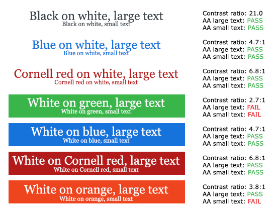
For contrast of text, WCAG AA requires that text smaller than 18pt needs to be at a ratio of 4.5:1. Text 18ptor larger, as well as bold text at 14pt or larger need a ratio of 3:1. Be careful though, as the point measurement is not the same as a pixel measurement: 1pt is equal to 1.333px, so 18pt is actually a 24px font size.
Link Contrast
It is important to remember that a link inside other text needs to be contrast compliant with the background and it also needs to have a 3:1 contrast with surrounding text. Additionally, be sure to use something other than color, such as underlining text, to indicate the presence of a link.
Images of text
When using an image of text, the text must have a contrast of 4.5:1 unless the text is:
- part of an inactive user interface component,
- is pure decoration,
- not visible to anyone,
- or part of a picture that contains significant other visual content.
You will also need to place alternative text on any images of text that are not decorative.
It is better to use actual type for text on a website when you can. When users zoom in, or are on mobile, images of text do not scale like actual text elements. Often the image will become pixelated or scale down to fit the screen and become difficult read.
Logotypes
If you have a logotype, or are putting in logotypes from outside places, you don’t need to worry about the contrast of the logo. Text that is part of a logo or brand name do not have a contrast requirement to meet. Just make sure that the alt text for a logotype is just the name of the organization. You do not need to write “Logo for Cornell University” or “Cornell University Logo,” you can just put “Cornell University.”
Comments?
To share feedback about this page or request support, log in with your NetID